The Other Side Of Two Dimensions
Friday, July 06, 2007

Sometime in 1985 I read A.K. Dewdney's The Planiverse, a strange novel about a two-dimensional world. Whenever I run into Dewdney Trunk Road (it seems to start and stop and meander through much of the Lower Mainland) I think of the Planiverse. Just like the inhabitants of The Planiverse would never think to look up and discover the third dimension, somehow it would be just as impossible to drive the length of Dewdney Trunk Road without getting lost, or would it?
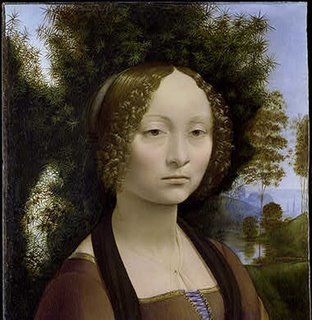
Five years ago Rosemary and I took Rebecca (then 5) to our first vacation trip together. We went to Washington DC. We saw a few paintings at the National Gallery but I left the best for last. I took Rebecca to the special room and she stared at the 16 13/16 x 14 9/16 oil on panel and said, "Papi, she looks like the Mona Lisa. This must be a painting by da Vinci." Was I really proud of her! What is not generally known about Ginevra de' Benci is that the painting has two sides, an obverse one.

I have never tried to tell my Scottish heritage son-in-law, Bruce Stewart, my Scottish joke about the one-sided pancakes which cost less than the two-sided variety!
The "rules" of composition in photography are artificial tricks that are supposed to induce the movement of a viewer's eyes when the viewer looks at a photograph. Photographs that work will have at least one diagonal line or the horizon line will not be equidistant from top and bottom as that would create, instantaneously, two equally boring photographs. These "rules" try to overcome the limitation that a photograph compresses (supress is perhaps better here) our three dimensional reality into two.
Since so many of the professional digital cameras (DSLRs) as well as the professional film ones (SLRs) have focal plane shutters, they create photographs in which one section of the photograph (where the shutter starts) will be earlier in time than the last part of the photograph. Without going into more confusing details, few of us realize that these photographs, while supressing that third dimension, depth, do include the fourth one, time! In brief in a portrait of yourself the top of your head will be "younger" than your feet.
But I would disagree that a photograph has only two dimensions (if we eliminate time). Da Vinci's portrait at the National Gallery is a good example. A photograph, a good photograph printed on heavy art photographic paper, will have an edge and heft. Vintage photographs (printed at about the time that they were taken) by such photographers as Edward Weston or Manuel Alvarez Bravo, will be signed in pencil on the back. It might have a date and or a dealer's stamp. For me these photographs, even mine, have three dimensions. I can hold them, I can cradle them, I can tear them and fold them.
On February 24 I gave a little talk at the Northern Voice Blogging Conference at UBC. As I spoke I had that day's blog projected behind me. It featured one of my favourite photographs of Rebecca. I had also brought a hard copy (a very large, beautifully framed light jet print) and had placed it behind me. After my talk a woman (there were perhaps a couple of hundred people in the room) came up to me and said, "I don't understand why you brought that (pointing at the framed photograph), after all you had it projected behind you."
That left me shocked and speechless and I have given it much thought all these months. I have come to the conclusion that our visual world (the world of pictures we look at) is in a transition from a two (really three) dimensional world to one of a true two dimensions as seen on a monitor or flat screened TV. Not only is that happening very quickly but it is also a transition from the static layout of a photo album, a magazine or a picture book to one of images that scroll in a rapid sequence.
It would seem that the cutting edge world of web design is being forced to incorporate video. One image is not enough. So we have flash and Flash and other named versions of Flash and flash. I would argue that just as Cinemascope could not in the end compete with the ease of flicking on a TV set our web as we know it will be doomed (will it?) if it attempts to imitate TV.
At my age (64) I must attempt to be objective and not denigrate this transition. I might like to hold a photograph that might even smell of fixer (and thus not be properly washed) but that does not mean that the two-dimensional images with all that contrast and vivid colour of a computer monitor are to be deemed inferior.
Until those monitor images (in those strict two dimensions) incorporate a true third of depth (as in 3D) I will personally enjoy the heft, smell, feel and that other side of a paper photograph!


