Our Mondrian On Burrard
Wednesday, August 19, 2009
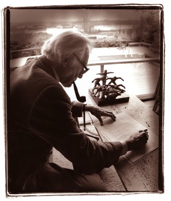
At a recent photography class at Van Arts I told my students that there were two sure ways of finding inspiration. Finding inspiration is one of the first prerequisites for selling oneself in the commercial, editorial and even the art market. For me as I comb through my extensive files I have narrowed those two ways to taking pictures of architects and of dancers. The former have money or deal with projects that involve lots of money. There is potential there. With dancers the money potential is slim. Dancers in our city do not make a lot of money so they don’t have money to share. But they hand out inspiration in spades.
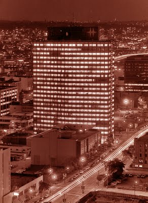
Since my class had the lofty title of Applied Commercial Photography (another way of explaining this would be for you to imagine teaching someone to swim while you are drowning) I stressed the architects. On a previous day I had told them of the lovely but now almost abandoned Dal Grauer Substation on Burrard next to the building that has gone through at least three names, BC Electric, BC Hydro and is now the Electra Building. The Electra is on Burrard and Nelson. When told my friend and Architect Abraham Rogatnick about this he insisted in giving me a copy of a book, B.C. Binning authored by Abraham Rogatnick, Ian M. Thom, Adele Weder and with an introduction by Arthur Erickson. The icing on the cake of this book is the beautiful design by George Vaitkunas. His design won him the Alcuin Society’s award for the best pictorial book of 2006.
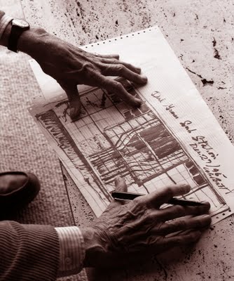
On December 27, 1995 I visited retired architect Ned Pratt at his home (he was a widower so he lived with his girlfriend in a beautiful old mansion on Southwest Marine Drive). I asked him how his Dal Grauer Substation came to be. He was most brief. “I sent a young chap to look up Mondrian at the Vancouver Public Library and to come back with an assessment.” That was all Pratt told me. I then asked him if he would draw for me a Mondrian rendering of his substation. This he did on computer paper. It is beautifully framed in gold leaf and I proudly display it in our dining room. While crossing Southwest Marine Drive in his VW Beetle Pratt was hit by a another car and died on February 24, 2006.
I will quote from Abraham Rogatnick’s essay on B.C. Binning called A Passion for the Contemporary.
The most spectacular of his [B.C. Binning] public art efforts began in 1952-53 when Binning collaborated on a design for a three-storey electric substation. The B.C. Electric Company knew they had to make their new building palatable to a public already tired of the drabness of the downtown street to which it was to be built.
The president of the electric company, Albert Edward “Dal” Grauer, was a cultured and sensitive appreciator of the arts who understood the aesthetic potential of such a monumental example of industrial technology. He agreed with Binning’s suggestion to the architect Ned Pratt that the entire exterior wall facing the street should be curtained with glass to reveal the interior architectural composition to the public. Binning created a composition of brilliant colours to enhance the meticulously arranged architectural and industrial elements that, like the O’Brien mural, slowed traffic on the street as people prolonged the moment to observe and enjoy it. It was one of the important sights recommended to visitors to the city.
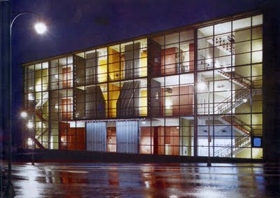
Although the original Dal Grauer Substation colur scheme was successful, Binning changed the colours in 1956 to bring the substation into harmony with the colours he had recommended for the design of the tall office building of the B.C. Electric Company rising next to the substation. Binning’s approach to colour was now deeply influenced by his study of the regional character of the natural context of the city. He was convinced that the most appropriate colouration of buildings in Vancouver would best enhance the urban scene by harmonizing with the northerly latitude and climate of Vancouver, with its surrounding rainforest, interlacing waterways, mist-catching mountains and greyer skies. Binning’s attention to architectural colour now began to emphasize greens, blues and greys, the scheme he applied to the new B.C. Electric Building and to the revised colour of the three-dimentional “mural” of its contigious substation.
B.C. Binning – A Passion for the Contemporary, Abraham Rogatnick.
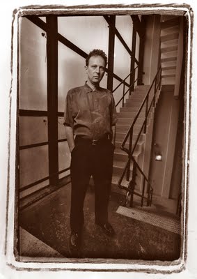
The wonderful Dal Grauer Substation has been through seismic upgrading but some BC Hydro official came up with the idea that there could be an electrical explosion within the substation so a yellowing thick plastic safety "glass" was installed which has made the building opaque. The rest of the building has deteriorated and most who pass by never give our Mondrian a look. In September 2005 I had the opportunity to explore the inside of the substation. Architect Lance Berelowitz, below, cited the building as one of his favourites in Vancouver. So we got permission to take this picture here. The insides are full of that wonder that once made us dream that technology, and specifically electrical technology would save mankind from destruction and lead us to a rosy future. For me when I gaze upon the face of an architect I still see that belief.
It is a scandal that such a monument to the Post War Modernist Style has been pretty well let go by both our city and the executives of BC Hydro.
All photos here are mine with the exception of the colour photo of the substation which has no photo credit in the B.C. Binning book and was provided courtesy of the architect's wife.


